I thought this would also be a good opportunity to share some of the work I've been doing up until this point. Some of it has been posted before, at various stages in its development, but there is certainly a lot that is new. Since describing each sketch would take a really long time, I'll just show photos grouped in sections by project. A representation of almost everything is here, with the exception of all of my calligraphy work, small assignments and any non-studio projects (writing, etc.). All in all it's about 80% of the work, though it looks like a lot less I think.
Type Cooker
These are a bunch of sketches made from constraints we were given. Constraints could be things like the length of the ascenders or descenders, the amount of contrast in the letterform (difference between thick and thin strokes), the width/proportions of the letters, special considerations (like cut-out counters, only drawn with straight lines, must contain 1/2 ligatures, etc). Here they are in chronological order:


 Contrast exercise and resulting alphabet
Starting with a drawing of a 'regular' contrast letterform (tupe for reading), we had to do a series of drawings to arrive at a low contrast (thick = thin strokes) and a high contrast. They are shown in that order. From there we had to take the regular contrast and extend it out to a full lowercase alphabet. This part was done quite quickly over the course of a week or so, so it's quite rough.


 Monogram
It's mostly finished now...

Drawbot/Programming


Plantin Revival
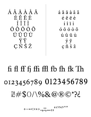
The project that occupied a huge part of our time since September was a project to digitize/revive a typeface that already exists in hot metal (ie: pre-computers) format. Using a book printed before 1940, we set out on the task to make a typeface revival of the typeface contained in the book. This was basically a primer in many aspects of type design, from type technology and production concerns to font management and design strategies. It also helped us learn by uncovering the hidden logic in an existing design.
In some ways, you could say that the process of designing type is full of small decisions a designer has to make, which, to the vast number of people, are quite inconsequential. It is when these tiny decisions are multiplied thousands of times on a printed page or a public sign that the decisions made previously start to become apparent in the way the type works as a whole. Good type usually has a hidden logic.
My project was a revival of Monotype Plantin from the early 20th century. Here are some of the results:
In the coming weeks I'll start to create a proposal for my final project which will take up almost all of my time here from mid-February till July 1. I'll keep you posted as things develop.


1 comment:
Your Monotype Plantin looks beautiful!
Post a Comment