Friday, November 30, 2007

Crossing Borders


Last weekend we attended the third annual Crossing Borders, a poetry and music festival held in The Hague. The theme of the week-long event is bringing together artists whose work blurs the definitions of music, poetry, art and performance, to celebrate and create dialog about the intersections of what are usually categorized as distinct genres. The most obvious example is the poetry of songwriting, but as we found, there are many others.

Some of the guests who's names you might recognize are: Rufus Wainwright, Salomon Rushdie, Chuck Palahniuk, The New Pornographers, Vic Chestnutt, and many, many, many more. Some artists sang, some read their poetry, some did both. Most of the poetry readings were followed by an interview, which was a really nice touch.

With Brian, we bought passes for the Thursday and the Saturday. The pass gave you access for any of the scheduled events for that particular day, meaning you kind of jumped around from room to room at your pleasure.

The first reading we attended was Richard Hell, who is best known as a former member of the the band Television. He read some articles he's recently written for a paper in Colorado I think it was, which discuss his aggressive thoughts on God. After he sat down for the most awkard interview on earth.


This photo is not really accurate as it suggests those two were somewhat relaxed with one another, and it kind of appears as though the interviewer is almost actually looking at Richard. The interviewer seemed only interested in discussing the one thing Richard Hell did not want to: Television and the birth of the New York Punk scene. Richard compromised by charismatically telling funny party stories from that time. It was cute, but I'm glad this was the first thing we saw.

After we listened to Gerard Malanga read some of his poetry. Gerard is a poet and a photographer that is best know for being Andy Warhol's right-hand-man in the days of The Factory. As a photographer he specializes in portraiture. As a poet, he does the same.


He was such an engaging reader that immediately following, we ran down to the bookstore and bought one of his anthologies. We asked him to sign it, and he took it upon himself to edit the mistakes!


We then saw Akron Family play probably the funniest and least-pretentious show I've ever seen. Their set ranged from hippie-folk to freestyle rap, and even included a children's song about a bear getting honey from an enchanted forest. Super fun.

Saturday we went early to get seats for one of the the most talked-about performers of the festival, Patti Smith. She was entirely captivating. In her incredibly thoughtful performance she read poems by Sylvia Plaith, Allen Ginsberg, and paraphrased Hamlet's soliloquy "To be or not to be". My most favourite part of her show was when she acoustically sang Lou Reed's "Perfect Day", with us – the audience – joining in for the chorus. It was very reminiscent of Buffy Saint-Marie's impromptu "Up Where We Belong" at our graduation ceremony.


After Patti, we saw Andrew Bird, who is probably the most talented human I've ever been in the same room with. His performance consisted of himself recording and playing back his music, and playing again with the recording, and recording that, and playing it back, etc. Using his feet to control the recording and play-back, he builds a song that is layered and gives the impression that there are many musicians on stage, when it's really just him. Not only is he an incredibly talented song-writer and musician, his timing is impeccable, and his whistling abilities were out of this world. And, on top of it all, he had a fever!

Please, buy tickets if he comes to a town near you!

Thursday, November 29, 2007

I should mention

that I got another job. Monday, Tuesday, and Wednesday, I'll be at my current job. Thursday and Friday I'll be working as a designer at a different studio.

Yay! Full-time employee!!

Also, here is a kalender I made for a bookstore.

Tuesday, November 27, 2007

Warning: this post will bore some readers.

Just in case some of you were getting anxious to see some of my latest squiggle drawings made with Python, I thought I'd make a post dedicated to it.

I realize that an entire post dedicated to programming probably isn't that appealing to a wide range of our audience so, just for you, I've added this special introduction:

I've never been all that interested in the whole LOLCats (type in lolcats into Google if you don't know what I'm talking about) thing, nor have I ever found it remotely funny. That is, until now.
Erik van Blokland introduced us to LOLCat programming language, a functional language some guy created to write functions and programs for his computer. Here is a sample showing some LOLCat programming language. Keep in mind that this actually works as a functioning language.

HAI CAN HAS STDIO?
I HAS A VAR
IM IN YR LOOP
UP VAR!!
1 VISIBLE VAR
IZ VAR BIGGER THAN 10?
KTHXBYE
IM OUTTA YR LOOP
K THXBYE

I bet if I told you that Python (or other programming languages) will play a critical role as a tool for design innovation (and innovative design), you'd probably laugh at me. However, I am absolutely certain that using programming as a tool is already (and will continue become) an incredibly valuable tool for designers, both in terms of generating form, as well as within the design process itself. For instance, take a look at this:
To make this in a program like Illustrator would be near-impossible (if you think you can do it, I challenge you to). However, after writing a simple code (with the help of Just van Rossum), each of the images above can be generated in a fraction of a second, and are totally unique from one another. The final result of this will eventually be a typeface that uses python to generate continuous ribbons in the form of lettershapes.

At the conference we attended in Antwerp in early November, one of the key lectures was on the role of Python as a design tool. The presenters developed an interface/interpreter called Nodebox (http://nodebox.net/) which can be used to make things like this:


This is a typeface which can be customized to varying degrees of 'evilness' and was made entirely in Python.

Here is another example where they wrote a code that creates a 'mood-board' like collage drawing images from Google based on specified key-words. The relevance of something like this to visual research is quite obvious I think as the placement and scale of images are all determined by the relevance of the image to the key-word entered.


A final example by the same group creates colour charts based also on key-words specified by the user.

Monday, November 26, 2007

Sorry, people . . .

Way back when I first posted our mailing address, it turns out that it was wrong! Eek! I know, I know. But that's mostly because we were very confused and many things on our mind, and didn't understand what our address even meant, let alone were able to identify that there was something out of place.

So, this is our correct address:

2e Schuytstraat 31
2517 XC The Hague
The Netherlands

If you have sent anything to us, I'm sorry to say we have not received it (and if we had, we'd be jerks to not aknowledge it anyway). So, update your address books!

Brian Went Dutch


Ross' brother was visiting The Hague from Oslo for the past five days. Here are some of the things he did:

He went for coffee at the Kicking Horse Café, Holland's only outlet of the Canadian coffee company.


He tried on some wooden shoes.


He saw the Noordzee.


He went for Mexican food in Delft. You might think that was an usual choice of restaurant, but when you haven't seen a burrito or a piña colada in three months. . .


He played with his brother in Rotterdam's most dangerous playground.


He went to the fun-but-complicated Comic Strip Musuem in Brussels, Belgium.


He sampled Belgian beer. Here he is trying to decide which to taste first.


And so much more!

In fact, he may even write about it on his own blog, Your Way to Norway. While you're there, I'm sure he'd appreciate it if you clicked on the ad so he can afford his final two weeks in Oslo.

Saturday, November 24, 2007

A Smiley Face?

You should all be relieved to know a small goal was achieved this afternoon: I've now seen the Bryan Adams space on the Rotterdam Walk of Fame.

Wednesday, November 21, 2007

It's live . . .

Here is a website I made at work for a Dutch photographer. (I don't like the photo on the opening page, but it was the photographer's choice.)

It's my first website! How exciting. And no, I didn't do the programming. I think it's better to leave that to the pros ( . . . Abi).

Monday, November 19, 2007

Great news!

An employee from the cable company came by today to fix our TV. We actually didn't know there was something wrong in the first place. Because we only received a few channels and they were all in Dutch, we haven't watched any TV for the past two and a half months. But then we got a new neighbor in the apartment next door, and she thought there was something wrong, and we should be getting more channels.

The main hook-up for the entire building is in our apartment, so we've had people from the cable company coming by lately to figure things out.

Anyway, to get to the point, we now have 38 channels of Dutch, French, and British television! It's so great! I watched Sesamstraat (Sesame Street – supposedly it's the best way to learn the language), Food Poker – a British show that combines two of Ross' passions – and what I'm most excited for, the Dutch version of Project Runway, Project Catwalk. I don't know what they're saying, but juicy drama is a universal language! I'm hooked!

Saturday, November 17, 2007

Sinter-chaos

I have a really funny video of the mayhem before the Sinterklaas parade, but Blogger is having problems posting it. So, I'll just give you a play-by-play.

It starts with someone throwing mini cookies into the crowd, which encourages children in their weird costumes to run from the other side of the street to collect them.


The kids were picking them up off the ground and putting them in their mouths. As they were doing this, more and more cookies are hitting everything in sight.


To express his joy, this kid starts bouncing around in a strange Zwarte Piet jig-like thing, as the young child in the background crawls under a car for a cookie.


I pan the camera and catch this kid in the red hat, just as he's about to throw a handful. He's scanning the crowd for a target, and when he sees me, he takes aim. . .


and fires! At this point, there is much jiggling of the camera, as I'm being pelted with cookies. (Note that other kid on the left. I don't trust those eyes.)


The mad dash for cookies is now taking place directly in front of me.


This little "bull-in-a-china-shop" gets in on the action. I think she ran from across the city when she heard there were cookies up for grabs. Look at the determination in her face: she only has one think on her mind. Cookies.

In the meantime, a hailing of cookies continues to spatter upon me.


This little girl is witnessing the measures her competition has gone to, to get the prize. Apparently there were cookies behind my feet, and that hell-bent little blond girl isn't just climbing all over my feet to get the cookies, she pries my legs apart to climb through.


As I'm losing my balance, I turn the camera to see who's throwing cookies at me, and it's that kid with the untrustworthy eyes! I knew it!


And now he's all shy. He knows I have evidence.


Blondie resurfaces from under the crowd's feet, no doubt with a Sinter-sack full of cookies. The competition on the left knows that although she's the one wearing the fancy costume, Blondie is the reigning champion of the cookie-scramble.


After this, Blondie skips away, like a sweet little girl.

The End.

Sinterklaas is in The Hague


I recently noticed a poster that read Sinterklaas was going to be on the old shopping street close to our home, today at 1:45pm. When the time came, I convinced Ross to put aside his homework so we could go see Sinterklaas.

Sinterklaas is a very special man to the Dutch. He is not what the Dutch call Santa Claus; they are two different people. In fact, Santa is here too, but according to my work mates, "nobody believes in him." Sinterklaas, on the other hand, is the real deal.

Every year around this time, he arrives from Spain on a steamboat. He lives in Spain the rest of the year, and if I was Mrs. Claus, I'd be pretty jealous. I've never been to the North Pole, but I've been to Spain, and I'm pretty sure I know where I'd prefer to spend my time off.

Sinterklaas' journey here is tracked on the news, and apparently he has terrible luck every year, and something always goes wrong. In previous years, he has had the map upside down, or was going in the wrong direction, or has forgotten all of his necessities back in Spain. Somehow, however, he always manages to get it together just in time. Once his steamboat arrives, he is publicly welcomed by the mayor of a different Dutch city each year. I don't know where he arrived this year, but he made his way to The Hague today.

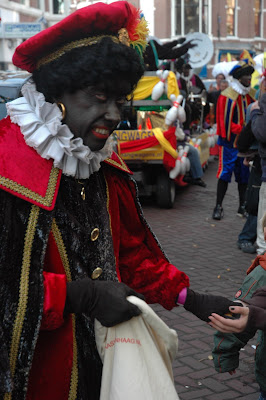
But Sinterklaas is not alone. First of all, he rides a beautiful white horse named Amerigo. Also, he has many helpers, known as Zwarte Piets. Zwarte Piets wear 16th century colourful Spanish clothes, but their most recognizable feature is their black faces. Supposedly they are black because they have the task of climbing down the chimneys and they are permanently covered in soot.

For us sensitive North Americans, the idea of seeing white people paint their faces black seems . . . hmmm . . . "inapropriate", but it's all a part of the Dutch holiday spirit.

When we made our way down to the street, I don't know what we were expecting, but I definitely didn't expect for all the kids to be dressed up. Some of them were dressed as Sinterklaas, but most of them were dressed as Zwarte Piets, complete with painted black faces.

We had been warned ahead of time by our Canadian neighbour, but it was still quite surprising to see these little blond-haired, blue-eyed, black-faced kids.


All the kids had Sinterklaas sacks, and we learned later that the Zwarte Piets hand out cookies. (Or, if you don't have a Sinter-sack, the Zwarte Piets will just throw cookies into your purse :) It was pretty chaotic. Obviously the kids were really excited. As everyone was waiting for Sinterklaas to arrive, many of the kids started throwing cookies at each other (see video.)

Finally, the event started to happen. I thought Sinterklaas was just going to be saying hello, but it was a full out parade! There were hundreds of Zwarte Piets singing, dancing, playing music, and throwing cookies in my purse.


This one grabbed me and started dancing and automatically posed for the photo:


It was by far the most chaotic, dangerous parade I've ever seen. The street was so narrow, I think it's a Christmas miracle that no one was run over.

Finally Sinterklaas arrived, on the beautiful Amerigo. Note that Sinterklaas is in much better physical heath than Santa Claus.


For someone that spends all year in Spain, he's pretty pale. Sinterklaas must be wearing lots of sunscreen.

It was very fun.

Wednesday, November 14, 2007

a byte or two

One of our other assignments currently is to create a monogram containing our first and last initial (RM). This has nothing to do with my actual monogram but it was a funny bi-product of something I was doing. I'll post the actual monogram in a few days or so.

R

Since Grace has made a few posts recently about the misconceptions people have of what is prototypically Canadian (see her last post + anything about Maple Syrup), it seems fitting to make a post that shows that the opposite is also true.

Tonight four of us were eating dinner before our night lecture when the shows Arrested Development and Curb Your Enthusiasm came up. Berton and I, being the only North Americans present (Mathieu is Swiss and Gus is Brazilian), were the only ones who knew what these two shows were and so our enthusiasm was quite evident I think. When we tried to describe Curb Your Enthusiasm, the obvious starting point was to say that it is based on the personality and life of Larry David "the guy who co-wrote Seinfeld".

Unfortunately, neither Mathieu nor Gus had ever seen Seinfeld, so the comparison was completely missed. To Berton and I, this was totally shocking. Seinfeld was in many ways a generation defining show and, like the Simpsons, has even been responsible for the introduction of now common phrases into North American speech.

On another note, I promised I would post some photos of my first venture into stone carving. This is the second assignment and it's currently in progress. I was hoping to finish it yesterday but we couldn't carve due to a big assembly of ambassadors who had a meeting scheduled at the school. Since our carving creates a lot sharp and repetitive banging sounds for hours on end, the school administration asked if we could postpone our class. Anyway, the assignment is to carve a capital R as this contains all the essential shapes that one needs to carve the rest of the letters. It works out well for me since I get a nice little initial out of the deal.

On the bike-ride home after our lecture in Delft, the Buitenhoff (parliament building) was nicely illuminated so I took a photo of it. See for yourself:

The Power of Celine

When someone asks me where I'm from, they usually do so like this: "Are you American or British?" When I answer that I'm from Canada, more often then not their answer is either "I love Celine Dion!"or, "Haha, you like Celine Dion."

I'm amused by this. Celine Dion has never been such a large part of my life. Now, it seems like I'm talking about every her other day. People have told me how inspired the are by her story of being in a large family and overcoming poverty. Did you even know she was poor? Cause I didn't.

On the first day after Ross and I landed in Holland we went to a café and Celine was belting out "All by myself . . . " If we weren't together, I probably would have burst into tears. In fact, a lot of Canadian songstresses are quite well-represented in this part of Europe. It is very common to hear Celine, Avril, Alanis, Nelly, and Diana in restaurants or coming from people's cars. Everyone now and then I even hear Feist.

Another Canadian we hear all the time is Bryan Adams. Seriously. They love that guy over here. He even has a star on the Rotterdam Walk of Fame. How many people can say that?

Monday, November 12, 2007

It's about time

I've been meaning to do this for some time now and have tried to make a post before (once I even made it as far as a full post that has been sitting in the drafts section of the blog for weeks). Thanks to a few friendly requests, I have finally been able to motivate myself to show a bit of what I've been doing over the last month:

The course thus far has been full of a fairly diverse mix of classes that range from being vaguely-related to fully interconnected. This is one aspect of the program that I really like. Even within such a specific discipline as Type Design, there are lots of avenues to specialize in, and the onus is on the student to figure out how the diverse topics we are covering might be able to relate to one another.

Another aspect of the program that I really enjoy is that it is incredibly easy to see the outcome of your efforts. It does not take long before you are able to visually see the results of what you are being taught. Even two months into the course I am able to arrange 10 sheets of calligraphy side by side in chronological order and take note of how far my writing has come. That being said, the progression is slow and you might say it's come from being outright atrocious to slightly less atrocious.

So, I suppose you all want to take a look at what I've been doing. There is a lot of stuff to show, so trying to describe it all in one post would be too much, so I'll try to post a few times over the next few days and each time show a different project we are working on.

Like I've said before, a lot of the first semester of the course is based on small assignments and many of these small assignments are based around writing. I have already mentioned that every week we do calligraphy exercises. The idea behind this is to understand through practice why the majority of our letterforms look the way they do and how different materials have influenced these shapes. Here are a few snapshots of two recent pages of calligraphy; one with the broad nib pen (first) and the other with the pointed pen (second). You can see how a small change in the pen shape has a huge bearing on the shapes of the letterforms. (I apologize in advance for the quality of images. It's late.)


In the past few weeks we've begun an ongoing activity in sketching letters, based largely on the models discovered through calligraphy. To do this, one of our teachers has been a little java application called Type Cooker which, when loaded, outputs a random series of variables specifying the characteristics of letterforms. For instance, it gives values for the type of construction (roman, italic), the type of contrast (broad nib, pointed pen, transitional, brush), the amount of contrast (none at all to extremely high), the various proportions of letters, and a few special characteristics (for newsprint, for display, must contain 1 ligature, can only contain straight lines, etc).

The premise of the assignment is that we all have our own set of sensibilities we will immediately gravitate towards when beginning to draw type. The purpose of the typecooker is to give a random list of 'ingredients' that will push us to think of letters we would not otherwise consider. The idea is to sketch quickly, so some are better than others:

(short ascenders, thin stroke, no contrast, rounded terminals, 1 ligrature, narrow, etc)

(italic, low contrast, thin, slight compressed, 1 ligature, long ascenders, long descenders)

(long ascenders, narrow, high contrast, wedge serifs, brush contrast, two ligatures)
(long ascenders, medium contrast, pointed pen, can only contain straight lines)


(swash initial, pointed pen, italic, low contrast, slab serifs) * yes, the serif on the d is going the wrong way.


The last thing I'll show in the vein of drawing/sketching is an assignment we did recently to understand how contrast works according to Gerrit Noordzij's theory in "the Stroke of the Pen". The idea was to explore the way in which low contrast (less difference between thick and thin strokes) letters are made by thickening the thin strokes of a letter drawn with a pointed pen or broad nib pen, and how high contrast letters are made by thickening the thick strokes of letters drawn the same way. The first drawing is what I deemed to be normal contrast, the second is the low contrast version made by thickening the thin strokes, and the last is the high contrast version made by thickening the thick strokes.


As you can tell, there is a huge emphasis on learning by doing and this is also one of the really strong points of the program. If I was to describe it to someone interested in going, I would say that you really gain an intimate understanding of the construction and shape of letterforms by making them yourself. The last example of this, which I will hopefully be able to post tomorrow, is stone carving. Starting three week ago, we have an 11 week course in stone carving. Again, the idea is that by constructing letterforms using historical models, you can begin to understand a bit about why letters look the way they do and how to make use of these conventions to create new and innovative type designs.